Work — Campaign concept & creative production

Innerspace Counseling

A single page of magazine space. One job: make someone who has never said it out loud say it for the first time. We built #IWILL — a campaign about the moment silence breaks.

ClientInnerspace Counseling — DBT-grounded outpatient mental health program, ages 8+, Old Bridge, NJ
EngagementCampaign platform + creative production
DeliverableSingle-page magazine advertisement — press-ready PDF/X-1a
ServicesPositioning, concept, copywriting, custom lettering, art direction

The challenge

Category advertising for people who need help and not ready to accept they need help.

Behavioral health advertising has a default setting: a calm stock photograph, a soft gradient, a list of conditions treated, a phone number. It is designed to look safe. What it actually does is speak about people in crisis rather than as them — and it asks the reader to identify with a diagnosis before they have identified with anything at all.

Innerspace Counseling had the harder version of that problem. As an outpatient program, it sits at the exact point where a person decides whether to get help or keep managing alone. The barrier at that point is not information. It is silence. Nobody calls an intake line because they read a list of services. They call because something finally gave them permission to say the thing out loud.

We had one page in a magazine to create that permission — in a format the reader can turn past in under a second, surrounded by advertising doing the opposite.

The idea

Don’t describe the illness. Publish the sentence.

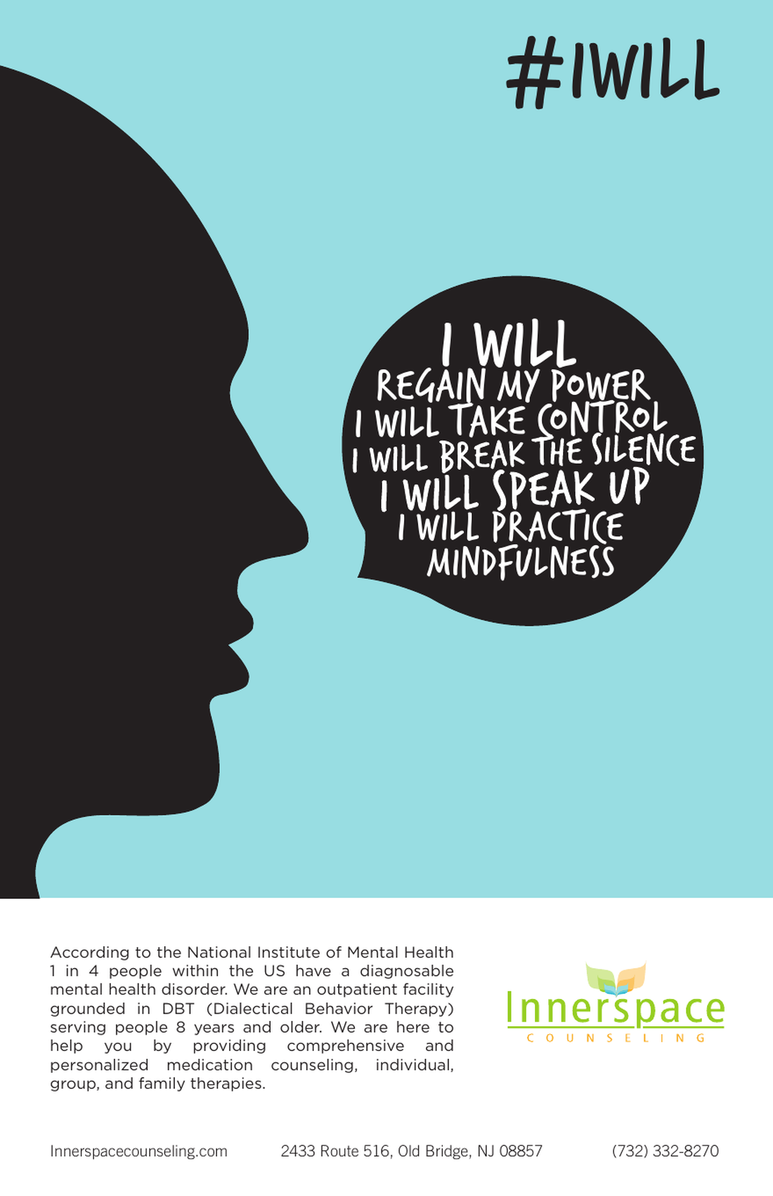
The final #IWILL magazine advertisement for Innerspace Counseling: a black profile silhouette on a teal field speaking a large black circle filled with hand-lettered white type reading 'I will regain my power, I will take control, I will break the silence, I will speak up, I will practice mindfulness.'

Final single-page magazine advertisement — Innerspace Counseling (press-ready PDF/X-1a)

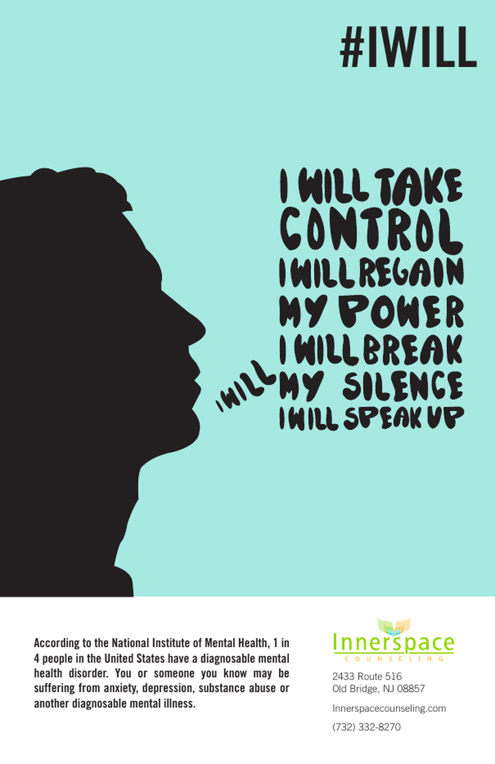
Instead of naming what is wrong with the reader, the ad hands them a script. A black profile faces open space, and what comes out of the mouth is hand-drawn type — not typeset, not clinical, the shape of a voice being raised.

The final layout holds that voice inside a single hard circle. Earlier routes let the lettering run loose across the page; the circle brought it back under control without flattening it — one dense black mass of first-person commitments reversed out in white, reading as a thought fully formed rather than a caption. #IWILL works as a headline, a hashtag, and a movement to join in the same three syllables, which is what let a treatment ad behave like a rallying cry.

The lines escalate from taking back power to speaking up, then land somewhere quieter and more actionable — I will practice mindfulness. That last line is what connects the rallying cry to the clinical program actually behind it.

I will regain my power. I will take control. I will break the silence. I will speak up. I will practice mindfulness.
What sits below the line The bottom third does the unglamorous work. First the NIMH figure — 1 in 4 people in the US have a diagnosable mental health disorder — then the specifics: an outpatient facility grounded in DBT (Dialectical Behavior Therapy), serving ages 8 and up, with medication counseling and individual, group, and family therapy. The statistic makes the reader feel accompanied rather than diagnosed; the services copy answers the question the headline provokes — what actually happens if I call?

The approach

Four decisions that made a page act like a movement.

01 — Find the real barrier

We reframed the brief from “advertise an outpatient program” to “lower the cost of saying it out loud.” That single move decided every element that followed: first-person voice, no imagery of clinicians, no list of conditions above the fold.

02 — Write the reader’s line, not ours

Every line is “I will” — a commitment the reader makes, not a claim the brand makes. The ladder climbs from regaining power to speaking up, then lands on something a person can do today: practice mindfulness. A rallying cry that ends in a first step, and quietly names the clinical model behind the program.

03 — Draw the voice

Set type reads as institutional. We replaced it with custom hand lettering, reversed white out of black and scaled so the boldest declarations carry the most weight — type that behaves like sound rather than copy.

04 — Contain it, then own the color

We tested letting the lettering run loose across the page; unbound type read as escape where the brief needed resolve. The circle was the answer — the only geometry in a layout otherwise made of organic silhouette and drawn letterforms. Set black on saturated teal, it cuts hard against the pastel gradients of the category, so the page is identifiable as Innerspace before a single word is read.

The exploration

Six routes, then back to the circle.

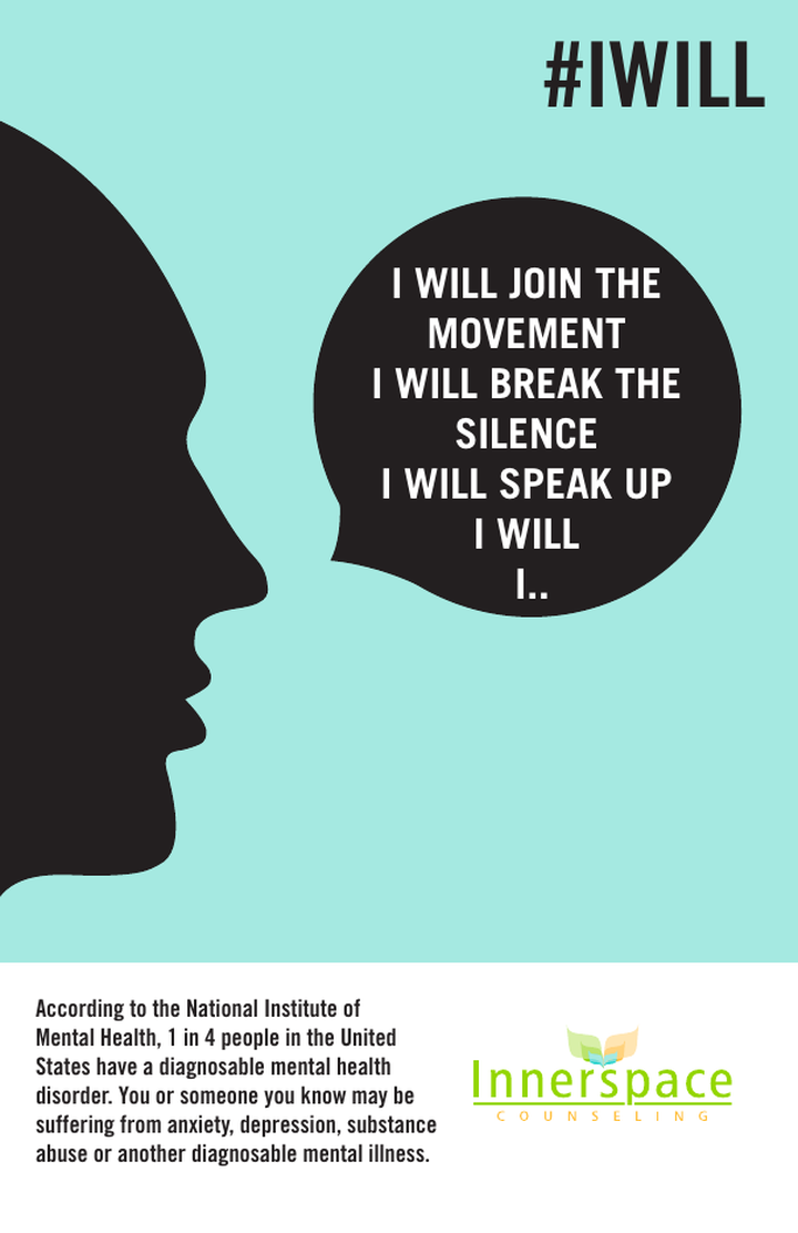
Early #IWILL concept: black silhouette with a rounded speech bubble containing set type.

Route 01Rounded bubble, set type — the container was right, but typeset words read as dialogue, not declaration.

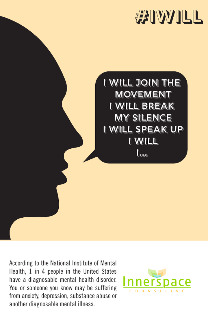
#IWILL concept on a cream background with a rectangular speech bubble.

Route 02Warm cream field — calmer, but it blends into the category it needed to interrupt.

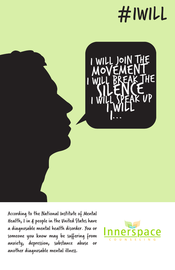
#IWILL concept on a green background with hand-lettered type inside the bubble.

Route 03Green field, lettering introduced — first test of drawn type inside the bubble.

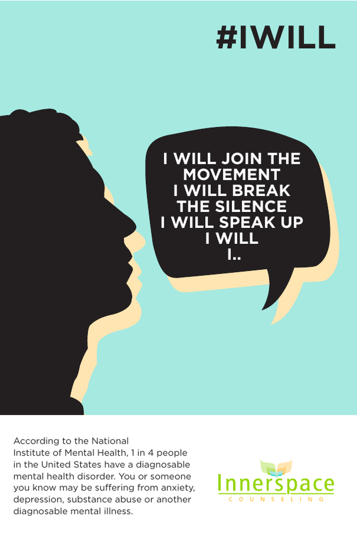
#IWILL concept with an offset cream shadow behind the silhouette and speech bubble.

Route 04Offset shadow — added depth and motion, but softened the starkness of the profile.

#IWILL concept with the hand lettering released from the bubble, flowing freely out of the mouth across the teal field.

Route 05Lettering unbound — words escape the container entirely. Explored, then pulled back: it read as escape, not resolve.

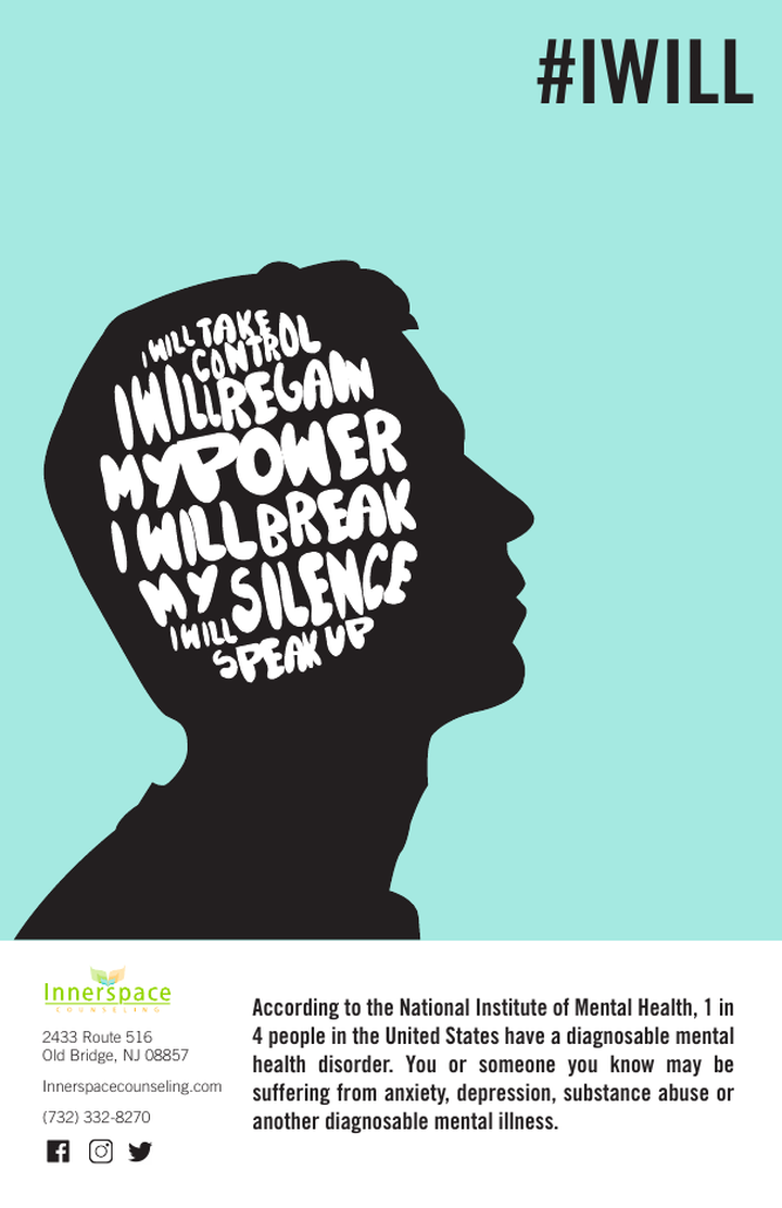
#IWILL concept with the hand lettering filling the interior of the head silhouette.

Route 06Words inside the head — a strong image of the unspoken, held for future campaign use.

The outcome

What the work changed.

A campaign, not an ad

One page became a reusable platform.

#IWILL was built as a system rather than a layout: the silhouette, the drawn voice, the open-ended line, and the color field extend to social, signage, waiting-room print, and awareness-month activations without redrawing the idea.

Distinct in a sea of sameness

Recognizable before it is read.

Against a category built on stock photography and soft gradients, the black-on-teal profile gives Innerspace a page that is identifiable at a glance and attributable at a distance — the practical definition of brand equity in print.

Message discipline

The brand stopped explaining and started inviting.

The reader’s own commitment owns the top two-thirds of the page; the NIMH figure, the DBT model, the age range, and the therapy formats sit below it. The ad earns attention with a voice, then answers the practical question with facts — in that order.

On measurement This engagement was scoped as campaign concept and creative production for a print placement, so response was not instrumented at the media level. Strategic Pixel now ships every campaign with tracking built in from the brief — unique call routing, tagged landing pages, and a shared scoreboard — so creative like this can be tied directly to intake volume.
Keep looking All work →

Your turn

Running category-standard advertising in a category nobody looks at?

Start a project →