A date you do not control
The trademark transfer sets the outside limit for the old mark’s presence. Fabrication lead times, permit calendars and crane windows do not move to accommodate it.
 strategic pixel
Work — Corporate real estate
A bank sold its 137-year-old logo and adopted a new one. That is a two-paragraph press release and a very long year for the people who own the buildings. The work: turn one identity decision into a buildable, permittable, inspectable standard — and get it onto every surface in the region without the estate looking abandoned while it happened.
The situation
In February 2007 Citigroup announced it was selling the red umbrella — a mark roughly 137 years old, inherited in the 1998 Travelers merger — back to the insurer, which promptly renamed itself The Travelers Companies and took the umbrella with it.1, 2 Chief executive Charles Prince framed it as the end of the multi-name conglomerate: one name, Citi, across every business unit.1, 3
Worth being precise about what actually changed, because it is the whole reason this is an execution story rather than a design one. The red arc was not new. Paula Scher had drawn it at Pentagram in 1998, at the first client meeting after the merger — an arc over the t of citi, derived from the Travelers umbrella itself.5, 7 So 2007 was not an act of design. It was an act of subtraction: remove the umbrella, shorten the name, and leave the mark that was already there standing on its own.
Citi Realty Services is the internal function that owns the physical consequence of that sentence. It is not a client-facing lending business; it is the group responsible for the premises the bank operates from — branches, offices, trading floors, data centres — across a portfolio spanning dozens of countries and headquartered at 388 Greenwich Street.6 The Northeast region carried the densest and most visible concentration of it: Manhattan towers, a retail branch network, and the headquarters campus itself.
So the announcement did not land as a marketing brief. It landed as an inventory problem with a deadline attached.

Umbrella and wordmark. The mark of a merged conglomerate, carrying the insurer’s 137-year-old symbol alongside the bank’s name.

Arc alone. Shorter name, no umbrella — and the 1998 arc, always a distillation of that umbrella, left to carry the brand by itself. The grey wordmark is period-correct, not a faded reproduction.8 This is the mark that actually went onto the buildings.

Blue, and settled. In 2011 the wordmark went grey to blue.8 The name did not move. The arc did not move. Fifteen years on, what the estate was re-marked with in 2007 is still what is on the buildings — which is the case for treating a rollout as infrastructure rather than a campaign.
Marks reproduced for identification only. Both are the trademarks of their respective owners; neither is a Strategic Pixel asset and no affiliation is implied.
The challenge
The design decision was made once, centrally, and it was elegant. Everything downstream of it was neither.
A corporate mark does not live in a brand book. It lives on parapets and awnings and revolving doors, on ATM fascias and queue stanchions and floor directories, on deposit envelopes and fire-evacuation plans and the badge reader in the lobby. Each of those objects has a different owner, a different landlord, a different approving authority, a different fabricator, and a different lead time. None of them care that the announcement already went out.
Two constraints made it harder than an ordinary refresh. First, this was not a refresh — the outgoing mark had been sold, so it was not simply dated, it was someone else’s property. Removal was not a nice-to-have on the back of the schedule. Second, the estate is customer-facing. A branch with the old sign down and the new one not yet up does not read as “in transition” to the person walking past. It reads as closed.
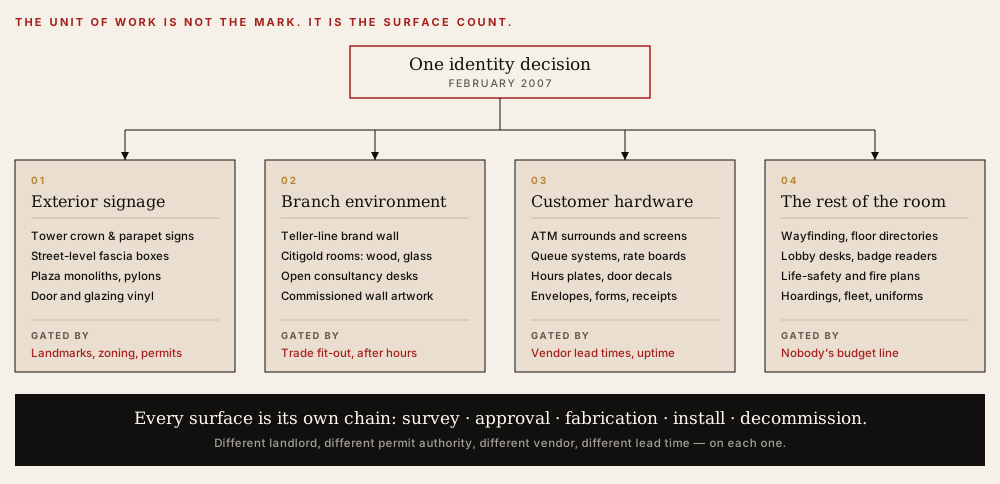
The taxonomy the work actually runs on. Drawn for this page as an explanation of the problem class — not a reproduction of any Citi document.
The trademark transfer sets the outside limit for the old mark’s presence. Fabrication lead times, permit calendars and crane windows do not move to accommodate it.
In the Northeast a meaningful share of the estate sits on protected or restricted façades. Sign approval is a public process with its own hearing schedule, and it is not expedited for rebrands.
Much of the network is leased. Signage rights, size, illumination and placement are lease terms — each one negotiated separately, some of them decades old.
A single sign shop can only produce so many illuminated fascias in a quarter. A regional programme is capacity-planned like manufacturing, not commissioned like design.
Interior work competes with trading hours, cash operations and customer traffic. Most of it happens overnight, which halves the crews available and doubles the coordination.
Sold trademarks need documented removal and disposal, not a skip behind the building. Decommissioning is a chain-of-custody exercise with a paper trail.
The standard
The new identity arrived with a designed environment attached. Pentagram’s programme for Citibank defined a fascia signage system built around a curved light box echoing the arc of the logo — explicitly designed to work across a variety of building types, including landmarked ones — alongside branch interiors organised around a blue brand wall behind the teller line, open consultancy desks, and a more restrained Citigold environment of warm wood panelling, frosted glass, rounded counters and commissioned photography in place of sales messaging.5
That is design intent, and it is excellent design intent. It is also not yet a thing a sign shop in New Jersey can quote against, or a landmarks commission can approve, or a facilities manager can reject a delivery for.
The realty-side job is the translation. Intent becomes a specification: illumination levels, mounting details, substrate and finish callouts, tolerances, permitted variants for the façades that cannot take the standard box, and — the part everyone skips — a defined answer for the sites that will need an exception, decided centrally rather than improvised locally by whoever is on site that week.
Not: here is the new look. But: here is what “correct” means, and who says so.
The approach
Nobody has an accurate list of their own signage. Existing records describe what was approved, not what is on the wall after twenty years of local replacements and landlord alterations. The first deliverable is a site-by-site inventory — photographed, measured, tied to lease and permit status — because a schedule built on the old asset register is a schedule built on fiction.
Split them and you have created a gap by contract: the demolition vendor is done, the fabrication vendor is not ready, and the site sits blank for weeks with nobody accountable for that state. Paired scope makes the blank window somebody’s problem, which is the only reliable way to make it short.
The cheapest route is the crew’s route — work the map, minimise travel. That route has no relationship to who sees what. Ordering the estate by audience exposure costs marginally more in logistics and changes what the public experiences: the addresses that carry the brand’s reputation are re-marked first and stay blank the shortest.
A standard is only real at the moment someone signs off an install. That means a sign-off checklist derived directly from the specification, a named person empowered to reject work, and a documented exception route so that a genuine site constraint produces a recorded decision rather than a quiet improvisation that becomes precedent.
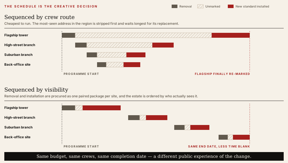
Step 03, drawn. Illustrative sequencing of a rollout — not a record of the actual programme schedule.
The blueprint
One mark retired, one adopted. A single decision, made centrally, with a date the rest of the organisation now has to meet.
Every surface found, measured, photographed and tied to its lease, permit and vendor position. The true scope is discovered here, not in the brief.
Paired remove-and-install packages, ordered by who sees them, capacity-planned against real fabrication throughput rather than an ideal calendar.
Sign-off checklists, a named owner of “correct,” and a recorded exception route — so the estate still matches the standard three years later.
In practice
The difference between a rollout that reads as a decision and one that reads as attrition is almost never the design. It is how the work is organised around the constraints nobody put in the brief.
A single controlled specification, versioned, with a named owner — not a brand PDF, a vendor’s shop drawing, and three regional interpretations all claiming authority. Ambiguity in the document becomes variation on the street.
Landmark review, zoning limits and lease signage clauses are not obstacles encountered after the design is fixed. Pulled forward, they define the variant set the standard needs to contain — which is precisely what a fascia system designed to sit on many building types is for.
When the outgoing identity has been sold, removal and disposal carry documentation obligations. Deciding early what gets scrapped, what gets archived and what gets photographed for the record keeps a decommissioning exercise from turning into a legal one.
The takeaway
The creative decision is one line. The programme is a number — of surfaces, owners, permits and lead times — and until somebody has counted it, every timeline being discussed is a guess. Restaurants, clinics, dealerships, franchise networks: same arithmetic, different objects.
Everyone plans the after state. Almost nobody plans the middle, which is the only state the public will actually spend months looking at. Sequencing is a brand decision that gets made by a logistics spreadsheet unless someone claims it.
Estates drift — a replacement here, a landlord alteration there. Without a named owner of the specification and a route for exceptions, the system that took a year to install is visibly inconsistent inside three.
The transaction and design facts above — the February 2007 sale of the umbrella trademark back to the insurer and its renaming to The Travelers Companies, the 1998 origin of the red arc in Paula Scher’s work for the merged Citigroup and its derivation from the Travelers umbrella, the removal of the façade umbrella and the 16-foot plaza sculpture at 388 Greenwich Street in the summer of 2007, Pentagram’s fascia and interior programme for Citibank, and the remit of Citi Realty Services — are public record and sourced below.
The three marks shown in the comparison above are third-party trademarks, reproduced at small size purely to identify the states this page discusses. They belong to their respective owners, they are not Strategic Pixel work, and their appearance here implies no affiliation, sponsorship or endorsement. Each is shown as it stood in the period labelled — hence the grey wordmark in the middle panel, which held from 2007 until the 2011 change to blue — and none has been recoloured, redrawn or otherwise altered. Only the transparent margin around each file was cropped and the artwork scaled to a common height.
Everything else drawn on this page is original to this write-up. The diagrams illustrate the problem class and the sequencing argument; they are not reproductions of Citi, Travelers or Pentagram materials. The arc form in the tile artwork is an abstract geometric element in Strategic Pixel’s own palette, not a depiction of any mark.
The constraints, standards practice and sequencing approach described here are an account of method: how a corporate identity change is executed across a physical estate. It is presented as professional background and approach, not as a claim of attributed results. No budgets, site counts, schedules, or programme outcomes are asserted, and none should be inferred. Citi is a former employer of Strategic Pixel’s founder, not a client of the agency; Pentagram is named as the design firm of record on the public identity programme, not as a collaborator. All marks belong to their owners.
Your turn